
I edited the image above to make it more appropriate to use on our website. I started by rotating the image 2 degrees counter clockwise so that the wall was straight in the frame (see below)

I then had to crop the image so the white border wasn't visible and the straightened image filled the frame. I did this by using the rectangular marquee tool (dotted line around the image in the screenshot above), I then selected Image > Crop and ended with the result in the image below.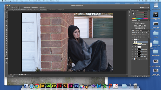
I selected the area of ground that was lit up by the sun and edited this area to make it the same colour as the rest of the ground so the image wasn't as bright and it looked more negative. I did this by making the area black and white and then altering the brightness and feathering the selection to blend the colours of the ground together.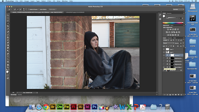
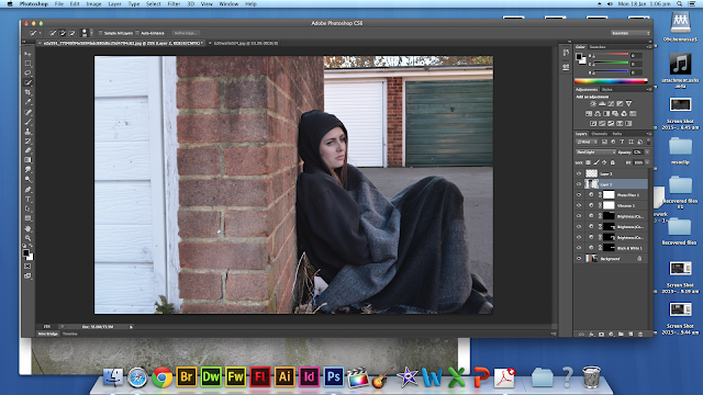
I then added a 'worn wall' image from the internet and set the layer mode to Hard Light do that the gradual faded dark area of the layer blended into the walls. I applies this to all the walls so that they looked worn and dirty. As the walls were previously too clean and new.
I then altered the image as a whole by decreasing the saturation and contrast to give the image a darker and less positive look. I also darkened the sky to make it look like cold evening lighting. To finish off, I used the stamp and spot healing tool to duplicate areas of the image to cover the folder she's sitting on and the plants around the doors.
This final edited image looks much more appropriate for genre than the original due to its dark and low-saturation look. I like the gradient on the wall and how the image looks less like daytime and the darkness of it makes it look a lot colder and will evoke sympathy fro the audience as the character in the frame looks cold and vulnerable.
No comments:
Post a Comment