Sunday 31 January 2016

Final poster

Final poster


Process


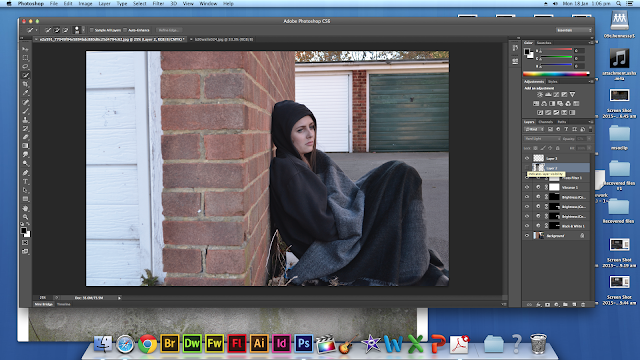
This is the original image that I started off with. I thought that this image was effective due to the brick wall behind her; conforming to conventions in urban films. I also liked how we took the golden rule into consideration when we took this photo so that the majority of the writing could go on the left hand side.


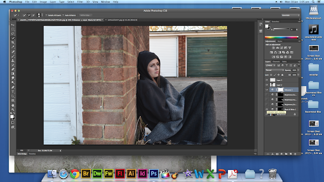
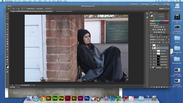
I took the feedback I got from my first draft into account and made the walls darker by using the burn tool on Photoshop as well as duplicating another layer of our actress to give the appearance of a shadow behind her. To make this appropriate for our genre, I also found some photos of graffiti on google images then layering this on top and lowering the opacity. I rubbed some parts of the graffiti out using the eraser tool to give it a more realistic, faded appearance.


I then added our title and billing block created by Chloe onto our poster. We decided to use the title from our teaser trailer with the orange background instead of a plain white or black title because we wanted to ensure that our fonts were the same throughout our trailer, poster and website. Due to the black background on the billing block, I had to use the effect 'divide' to get rid of the black background but keep the white text. 


The star ratings/reviews were created by finding an image of a 5 star rating on google then writing the review using the text tool on Photoshop. These reviews were taken from our previous poster deconstructions. This was repeated three times vertically to give us 3 reviews. I also included images of the awards received for this film on the side of our poster but making them white to follow the colour scheme.

Lastly, I added our age rating by our billing block and "From the producer of Fishtank" so that those who enjoyed Fishtank may also enjoy our film. We then added our tagline "Freedom comes with responsibility. Consciousness comes with pain" ensuring that it was smaller than our title.

Thursday 28 January 2016

Deconstruction of Genre

What is Genre?

In film theoryfilm genre refers to the method of categorizing films based on similarities in the narrative elements from which films are constructed or the emotional responses they elicit. Most theories of film genre are borrowed from literary genre criticism. Besides the basic distinction in genre between fiction and documentary, film genres can be categorized in several ways.

What are Sub-Genres?


Sub-Genres are identifiable sub-classes within the larger film genre, with their own distictive subject matter, style, formulas and iconography. For example the film 'When Harry met Sally' would have the genre 'comedy' and the sub-genre would be 'romantic-comedy' and the film 'James Bond' would have the genre 'action' and the sub-genre 'spy'. 

Our genre?


The genre in our teaser trailer is 'Teen Social realism'. Social realism refers to the work photographers and filmmakers that draw attention to the everyday conditions of the working class and the poor; social realists are critical of the social structures which maintain these conditions. We have taken the generic stereotypes of teenagers and enhanced them to create an interesting narrative for the audience. The miss-en-scene such as the drugs and cigarettes is how we portrayed the idea of social realism without teenagers. 


Common conventions of our Genre:
- Location setting (not in a studio)- Fish Tank
- Wide shots- Bullet Boy 
- Non-professional actors- Fish Tank
- Semi-improvised scripts- Ken Loach
- Humour and seriousness 
- The erosion of regional identities- Yasmin 
- Wider social issues explored- The Full Monty 
- Emotional and dramatic individual stories


Photoshop Work for the Poster

I edited the image above to make it more appropriate to use on our website. I started by rotating the image 2 degrees counter clockwise so that the wall was straight in the frame (see below)

I then had to crop the image so the white border wasn't visible and the straightened image filled the frame. I did this by using the rectangular marquee tool (dotted line around the image in the screenshot above), I then selected Image > Crop and ended with the result in the image below.
I selected the area of ground that was lit up by the sun and edited this area to make it the same colour as the rest of the ground so the image wasn't as bright and it looked more negative. I did this by making the area black and white and then altering the brightness and feathering the selection to blend the colours of the ground together.
I then added a 'worn wall' image from the internet and set the layer mode to Hard Light do that the gradual faded dark area of the layer blended into the walls. I applies this to all the walls so that they looked worn and dirty. As the walls were previously too clean and new.
I then altered the image as a whole by decreasing the saturation and contrast to give the image a darker and less positive look. I also darkened the sky to make it look like cold evening lighting. To finish off, I used the stamp and spot healing tool to duplicate areas of the image to cover the folder she's sitting on and the plants around the doors.

This final edited image looks much more appropriate for genre than the original due to its dark and low-saturation look. I like the gradient on the wall and how the image looks less like daytime and the darkness of it makes it look a lot colder and will evoke sympathy fro the audience as the character in the frame looks cold and vulnerable.


Wednesday 27 January 2016

British social realism

Social realism is a genre of film that focuses on issues in modern society which is represented in different ideologies. Some themes that occur in modern contemporary social realism films include money, drugs, prostitution and sex as well as class and political views.

Common conventions
  • Usually focuses on the working class
  • Based in run down areas in different cities
  • Young teenagers and young adults; appeals to a young audience
Examples of social realist films
  • This is England
  • London to Brighton
  • Fishtank
  • Adulthood
  • Kidulthood
  • Anuvahood
  • Billy Elliot
  • Trainspotting

Deconstruction of mise-en scene and titles in Ill Manors

Ill Manors is a British crime drama film written, co-scored and directed by Plan B. The film revolves around the lives of eight main characters and features six original songs by Plan B, which act as a narration for the film. Ill Manors is a multi-character story, set over the course of seven days, a scenario where everyone is fighting for respect. The film focuses on eight core characters, and their circles of violence, as they struggle to survive on the streets. Each story is also represented by a different rap song performed by Plan B.

Mise-en Scene


I feel that the mise-en scene in this trailer is relevant to our teaser trailer as it includes shots of cocaine, a teenage girl smoking, a blade, abuse and alcohol. These are all issues that teenagers might face so I think that we can take inspiration from these mise-en scene and incorporate them into our teaser trailer. The shots of the blade, cocaine, smoking and alcohol are effective because our genre is based on teen urban/social realism and these are some things that people associate teenagers with. Our teaser trailer has a sense of mental illness so the blade may be effective as it could symbolize that she has to turn to self harm because she is struggling to cope with her problems.


Titles/Reviews


These titles are placed in front of a time-lapse of a motorway. I think that this is effective as establishing/wide shots are usually used in urban films and the time-lapse captures the movement of the cars and how busy the city is.

Deconstruction of Adulthood

Adulthood is a 2008 British drama film. It was directed and written by Noel Clarke, who also stars as the protagonist, Sam Peel. Adulthood is a sequel to the 2006 film Kidulthood, which Clarke also wrote, and depicts Peel’s experiences after he is released from jail.
Six years after being jailed for killing Trife, Sam is released from prison. During the course of the film, it is revealed that Sam has changed dramatically and is not the person he was six years ago. He has learnt from his mistakes and is still haunted by his crime.

Production Company


Adulthood is produced by IFC Films; a production company that we have chosen to distribute our teaser trailer. Through my research into our genre, I've found that IFC Films tend to distribute teen urban/social realist films, making it appropriate for our trailer. 

Mise-en Scene - Location

The mise-en scene used in this film conforms to common conventions of an urban film as it is based in an urban area/inner city of London featuring shots of council estate and ‘chavs’. The trailer shows iconography of London such as undergrounds, hammersmith station and red buses.
Titles
The titles are in bold which is commonly used in urban films. The titles tells us the storyline and creates a sense of enigma.

Soundtrack

Awards and nominations
  • Screen Nation: Honorary Production Award 2009 – Adulthood – Winner
  • BAFTA Awards: Orange Rising Star Award 2009 – Noel Clarke – Winner

Website Practical 2


Awards- I Uploaded the background images of the awards and then changed the colour to white as the black wasn't visible with the background image. I then typed in the same awards that we used in the trailer and then I made the background transparent which was very simple as the website has a effect which does it quickly instead of having to use Photoshop.

Title- I decided to use the same font as the one in the trailer and the poster to make it all have the same house style. I made the title the largest font size on the website so it would stand out and interlinked the realise date with the page colours e.g. IPC films and the awards. I then placed them together on the brick wall which has the most basic background so it doesn't blend it.

Trailer- I searched for our teaser trailer on YouTube, uploaded it and then re-sized it. I then went on the video settings and made it auto-play when the website is loaded. I then removed the frame and got rid of the titles on top of the video.

IPC films- I uploaded the logo of our production company and resized it and added it next to the drop down menu.

Background- The background image was taken next to an alley way at a garage area. This image was then edited on Photoshop to make it look darker as it was taken in the day time and the wall was made to look older. We decided upon this image instead of the close up this makes the character look more homeless.

Drop-down menu- I changed the font from pink to white so that the colours on the website interlinked  and removed the separators in the menu.

Thursday 21 January 2016

Reviews in Boyhood

We will be using titles and reviews in our teaser trailer so I have taken inspiration from Boyhood since it's a social realist film in our genre. Some of the reviews come from well known newspapers and film critics. 


I think that the font used in the trailer is effective because this font is commonly used in teen urban films. The reviews and quotes are also relatively short, making it easy to read. The reviews towards the end of the trailer consists of short buzzwords such as 'dazzling' 'perfect' 'extraordinary' etc, which captures the audience's attention. I also like how they have listed their social media on the end screen with each iconic logo from each social networking site.

Deconstruction of Boyhood


Boyhood is a 2014 American independent coming-of-age drama film, written and directed by Richard Linklater, and starring Patricia Arquette, Ellar Coltrane, Lorelei Linklater, and Ethan Hawke. Shot intermittently from 2002 to 2013, Boyhood depicts the childhood and adolescence of Mason Evans, Jr. (Coltrane) from ages six to eighteen as he grows up in Texas with divorced parents. 

Boyhood is produced by IFC Ptroductions and distributed by IFC Films and Universal Pictures. IFC Films is a production company that distributes similar films in our genre which is why we have taken inspiration from Boyhood. 

Boyhood is a social realism film and covers issues such as divorce, domestic abuse, alcohol, drugs, school/graduation and relationships.


Boyhood soundtrack

Yellow - Coldplay
Hate to say I told you so - The Hives
Anthem Part Two - Blink 182
Beyond the Horizon - Bob Dylan

Deconstruction of film posters


  • Pastel/neutral colour scheme; blue and pink connotes elements of romance that may occur throughout the film which is commonly used in romance/teen films
  • Reviews, star ratings and awards that the film has won stand out to show that it's a film worth seeing
  • The main actress is the only one in the poster so this shows that she is the main focus and the film most likely revolves around her and her life
  • Effective positioning as the golden rule has been used so your eyes automatically focus on the girl
  • Sans serif font which is a contemporary font
  • The torn wallpaper in the background could symbolize neglect and the poor lifestyle
  •  Unique film poster which incorporates the use of illustrations, shading and black outlines which makes it look quite animated - the illustrations and shading further enhances the idea of a typical diary for a teenage girl as it makes it quite personal
  • Again, the same colour scheme as Fishtank and the use of reviews and star ratings, conforming to common conventions in teen urban film posters
  • The font is quite messy unlike Fishtank which is looks tidy with sharp edges, the font used in the poster imitates her handwriting since it's a diary
  • "Some things are best kept secret" - the tagline is relevant to the film and title since it's about a diary
  • This is a social realist film; the mum is holding a cigarette which could show that issues such as smoking/drug-use is covered in this film. Also, the review "finally a film that gets youth" shows that it is a relatable film which covers issues that youths will face
  • The gun in the poster is coincidentally pointing to the young girl
  • London and Brighton are both very different locations so there is a strong contrast; both London and Brighton are in bold
  • Font has a scratched effect to show that it's an urban movie that covers social realism
  • "Innocence has nowhere to hide" - although she is an innocent young girl, she still has to face reality and issues such as prostitution, being independent, etc.
  • A young boy is laying on the grass which is effective as this film is about a boy growing up and we usually associate grass with childhood, parks and fun.
  • The poster is very simple as the quote at the top of the poster tells us what it's about
  • The font of 'Boyhood' looks quite messy, almost like a child wrote it; very simple colours - possibly enhancing how simple childhood is? 

Tuesday 19 January 2016

Editing the Website

Editing the Website 

To make the website more suitable for our target audience, I added some social media apps to the page. 

An example is the 'YouTube Subscribe Button'. This allows the people viewing the website to directly subscribe to our youtube channel. This could be used if we were to release other trailers, so that we could update the fans regularly with new content. 

To ensure that it works, we have to register our youtube address. I copied and pasted this from the channel so it is correct. On the website, it appears as the same subscribe button as on youtube pages, so it easy for fans to click. 

Another app that I added to the website was the 'Twitter Tweet', this allowed us to set a pre-set tweet so that fans are able to share the youtube link to their follows, increasing publicity.

I chose the set tweet to be 'Can't wait to see this film! www.youtube.com/VIDEOURL'. This will mean that people will want to click the link to watch the trailer. 

This is the overall look of the website.

IFC Films research


IFC films is a production company with its headquarters based in New York. The independent company was founded in 1999 and has since then produced multiple motion pictures for niche audiences. IFC films is owned by parent company AMC Networks who has several subsidiaries including television channels in the US which feature films selected in the Sundance festival (SundanceTV)

Films produced by the company include;

  • Fish Tank - a social realist film which follows the complicated life of a young working class girl - Budget £1.8 million - Box Office £1.5 million
  • Boyhood - another social realist film filmed over a decade to follow the life of the same actor as he grew up - Budget $4 million - Box Office $44 million
  • Farhenheit 9/11 - a controversial documentary film by Michael Moor that criticised the war on terror and the media and political reactions - Budget $6 million - $222.5 million
  • The Human Centipede - another controversial film this time in the horror genre, it has been banned in several countries including the sequel in the UK- Box office - $252,206

As IFC films is an independent company that has produced other social realism films similar to ours before, we decided to use this company for our film as their films have an existing target audience. Films such as Fish Tank and Boyhood follow a similar theme to our film, Eighteen, by following the life on an individual in a realistic situation - not always with a happy ending.

Monday 18 January 2016

Creating a Production Company

Creating a Production Company

We all created a production company so that we could choose the best to put at the beginning of the teaser trailer. 

To create mine, I used a clip that we didn't use during the trailer. It was a clip of fire in a fire pit. 

To start, I dragged the clip into the timeline.

 I then shortened it, and trimmed it to the exact part of the clip I wanted. 

I then dragged the 'kaleidoscope' effect onto the clip. I repositioned the square to be replicated so that it was half of the fire.  

This created the below effect. 


I added a basic title to the start of the fire, so that the title would appear when the fire ignited. 

I changed the font, size and position to the text below. 


Friday 15 January 2016

Creating our poster

  • We felt that the brick wall behind our actress was too plain so i used the burn tool on photoshop to make it darker and add graffiti 
  • The brick wall was effective as our genre is typically set in an urban area with alleyways and council estates in the background.
  • I then found an image of the star ratings and combined this with some reviews using photoshop. These reviews were found online for other similar films in our genre.
  • Our tagline is much smaller than our title; conforming to common representations of film posters.
  • The billings block was created by Chloe which was then inserted along the bottom of our poster.


Evaluation

I think that this poster is much better than the first draft as it includes much more advance photoshopping. However, I feel that this poster could be improved by changing the font of the title and making all of the text white.