Saturday, 31 October 2015

Evaluation of individual shots

Titles
We intended for this scene to look like the name of our film written in cocaine. We used flour to look as close to the drug as possible.
Take 1 - We just blew the flour away normally but as the flour was compressed where we had rolled a rolling pin over it to flatten it it did not blow away.
Take 2 - we wiped the flour away with a hand, it looks successful but was not what we had planned on the storyboard
Take 3 - a hairdryer was used outside to blow the flour away, there is a reflection of the hairdryer on the tile but the overall effect was successful

Smoking scene
We tried a range of shots here to shot the character smoking. This included an extreme close up of the end of the cigarette. Some of the shots are slightly overexposed so these may have to be shot again.

Close-Up of "Drugs
We used caster sugar and water in a spoon to look like herion and we used a +10 macro close up lens attachment to film the spoon close up. We did the same with golden syrup in the spoon and held a lighter underneath to make the shots look realistic. The shallow depth of field in the shot means the reflection of the lighter is seen in the tile in the background as an orb light circle which makes the shot more aesthetically successful and intriguing.

Practical: Fake Cigarettes

As our main actress does not smoke and would prefer not to smoke a real cigarette during the trailer filming, I have decided to make a fake cigarette to create the illusion that the actress is smoking.

I used:

  • Cigarette Paper
  • Kitchen Paper
  • Dried Parsley
I first cut the kitchen paper to the length of the cigarette paper and folded it in half, then sprinkled the dried parsley into the kitchen paper.
I then rolled the kitchen paper around the parsley until it was small enough to have the cigarette paper wrapped around it. This part was quite difficult to do as I had to keep the paper tight or the cigarette paper would not fit around it.
Evaluation

What went well?
  • The cigarettes were very simple to make
  • The final outcome was successful as they looked very convincing
  • The model could smoke in the scenes without using real cigarettes which she was not comfortable with
  • I also asked a smoker for an empty cigarette box to store the fake ones in to make the, look more convincing and the cigarette packet could be used in our shots


How could they be improved?
  • Verity didn't particularly like the taste of the cigarette
  • They were quite hard to light and did not stay lit for all the shots
Overall, I think the fake cigarettes were successful as they looked convincing and looked exactly how we wanted them to.


Friday, 23 October 2015

Actors in our production

  • In our teaser trailer, we will have one main actress playing Rose. Rose is an innocent character represented as vulnerable due to her mental health issues as a result of becoming an adult with responsibilities she struggles to handle.

  • We listed students, focussing on drama students, who could play the role and then concluded a high level of acting skills would not be necessary due to an absence of diegetic dialogue. Verity in our group therefore volunteered to play the part of Rose as she would have to be on location to help with filming anyway so it was more practical for her to act in our trailer.
  • Verity acted in our AS coursework piece of a film opening and has no previous acting experience other than this however having no diegetic sounds or dialogue means she does not have to be an experienced actor as she will not be speaking.

  • For another scene we needed friends to sit with Rose in public places such as school and friends houses. We therefore asked Verity's real friends to sit with her and act naturally and we positioned the camera on a tripod to record the interactions between them to show Rose when she was happier before she became depressed.
  • As the actors were only required to act naturally and joke around, again, minimal acting skills were required which made it easier to find actors.

Wednesday, 21 October 2015

Deconstruction of Landscape Posters

Deconstruction of Landscape Posters

A convention of the social realism genre is having a landscape poster. Before drawing up designs for our own film. I deconstructed a number of other, social realism landscape posters.
 
  •  The colour scheme consists of blues, greys and purples. The purple stands out well on the grey background, making the title the main focus of the poster.
  • The title is slightly below the centre line, this conforms to the golden rule as the eye is draw from the title to the boy in the foreground, up to the character in the background and then to the pylons.
  • The white typography stating the director of the film stands out more than the title of the film, this is a common convention for social realism films, as usually the director is an up and rising star.
  • The billing's block is above to conventional place and right below the title. This means that the bottom of the poster is empty, this could be used to represent that the boy in the poster is isolated and has nothing around him.
  • The plot of the film is not given away, there is a lot of enigma surrounding the poster. For example, there is no tagline for the audience to understand what the film is about, and the character in the background is unknown.
  • The genre is slightly revealed by the tracksuit that the character is wearing and the pylon's in the background. Both of these are common conventions of the working class.
 

  • The colour scheme is grayscale with the bold 'pops' of hot pink. This makes certain typography stand out against the image drawing the audience's eye.
  • The title is in the centre of the page, which subverts the golden rule, although, the other 'pop' of pink is in the top left hand corner, which is the main area that the eye is drawn to. This text is review from the Independent (a well known newspaper) saying that it is the 'Coolest British Movie of 2007', attracting the target audience.
  • The title is surrounded by other grey text. Again, the director is shown above the title, a common convention of social realism films. Below are the main actors, which again, are commonly shown on posters of this genre.
  • The plot is not given away by the poster and there is a lot of enigma surrounding the film, for example, who the character is and how he is related to the title. The background is white on one side of the character and black on the other, this is open to many interpretations. Examples are that the character is bad (represented by black) and is moving towards a better life (represented by white). Or that the character has a good and bad side.  
  • The billing's block is left aligned, this is unusual for a poster as normally, the billings block is central in the centre bottom of the poster.


  •  The title of the film is the main focus of the poster. It is large, bold, capitalised typography in a slightly gradient off-white. It is slightly above centre, conforming to the golden rule and fills the entire width and a quarter of the poster's height.
  • The other colour used throughout the poster is a corally-red. This is used on the 'based on the shocking true story', the reviews and awards. This colour is used on the text that is smaller that the title.
  • There is a main character in the centre of the poster, which draws the eye from the title, down the character, to the reviews and back to the top. This means that the audience spend a lot of time looking around the poster.
  • Again, the director of the film is shown, although this time is it only small compared to it being a large statement on the other two posters.
  • The billing's block of this film is normal (centralised in the centre of the poster), although the size is a lot smaller than the other posters.
  • Again, there is a lot of enigma around the film, as to who the character is and what the true story is. The location is not a clue as it is unclear, there is a white fence, but nothing can be seen apart from this.


The inspiration that I will take from these posters for the creation of our poster, is that bright bold colours that are paired with neutral, more pastel colours. I believe that this is a good feature, and could be a factor used to draw the audiences' attention around the poster, conforming to the golden rule.

Tuesday, 20 October 2015

Outfit and make-up

I have taken inspiration from "The A-Team" by Ed Sheeran. The video narrates a girl who is addicted to drugs, living on the streets of London. The inspired outfit and make-up will be effective especially for our train scene towards the end of our trailer where our main character is running away from home. 


Make-up
The make-up is very minimal and simple with only mascara and possibly foundation. Her eye make-up will be smudged to show that it's not fresh make-up and that she has been crying. Light brown eyeshadow can also be smudged around the actress' eyes to emphasize how tired she is and the effects of the drugs. 
Outfits


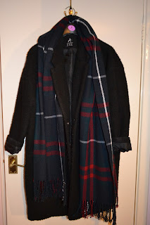
The outfits will vary throughout the trailer as the actress will be transitioning from good to bad. During her good stage, she will wear innocent and stereotypical clothes that 18 year olds wear such as leather jackets and jeans. However, as her character develops, she will be wearing more black clothing with visible tattoos on her body. In the scenes where she is running away from home to the train station, she will be wearing lots of layers such as a scarf, an oversized hoodie or coat. The black coat in the image above was inspired by "The A-Team".  

Tattoo for main character

We have decided to buy some temporary tattoos for our film so they look more realistic. The tattoos will represent her name 'Rose' and the character once she has gone from good to bad. However, if we can't find temporary tattoos, we will be drawing them so I have done a practical task on how her tattoo might look like. As a group, we decided we wanted the main character to have some rose tattoos with thorns to portray her rebellious stage. A tattoo of the male character's name will also be added onto her wrist.  

I have drawn the following tattoo with some sharpies and added shading to make it look more realistic:


Saturday, 17 October 2015

Deconstruction of "It's kind of a funny story" trailer

Deconstruction of "It's kind of a funny story"

A clinically depressed teenager, Craig Gilner, gets a new start after he checks himself into an adult psychiatric ward. 


  • The trailer begins with the age rating screen which lasts from 0.00 to 0.05 seconds.
  • I think that the production company screen is effective because of the background. The image in the background relates to the name of the production company and I like how the 'o' is out of focus. 

  • The trailer makes it clear on what the film is going to be about. We know that there's a psychological aspect as it is set in a mental health clinic and it focuses on what's going on inside the male character's head. To emphasize the psychological aspect, there is a close up shot of Craig's eyes then he suddenly wakes up from a dream.

  • I like the titles used because before the first title plays at 1:53, Noelle is referring to Craig's mind which then zooms into his eye then transitions into the title. The background of the title moves and the use of illustration rather than a real video makes it seem like an imaginary world; which again links back to the psychological aspect in the film. 
  • As the first title appears, it is accompanied by the song "Oh my god" by Ida Maria. This song is very upbeat and gives off a happy vibe; the clips also transition much faster with more cutaways. Before the first title, there was only diegetic dialogue with little non-diegetic music in the background.  

Storybord draft 2


Fake wound tutorial

To re-create a fake wound on your arm here are the following that you will need:
- An alcohol base substance
- A bruise pallet
- Fake blood
- Nose and scar wax
- A cocktail stick

- Firstly you need to apply the alcohol base substance on your arm using a cotton pad.

- Then get the amount of wax you wish you use and rub it between your hands to make it easier to mold with.
- Then apply the wax onto your arm and spread it across making sure that it evens out with your skin.
- Using the cocktail stick make a line going down the wax.

- Start dabbing on the red colour from the bruise pallet all across the wax.

- Then use the other colours, dark blue, brown and yellow and apply them all the regions that are still showing the wax.

- Using the cocktail stick, apply a small amount of fake blood into the lid of the container and spread across the scar in the wax.

- If applicable, use the stick again horizontally.

- Keep adding more fake blood into the wound until it becomes dark red.

- To create a more effective wound, do the same throughout but on smaller wounds, either side of the main wound.


Black eye and cut lip tutorial


To create this fake black eye and cut lip to represent a beaten up look, click onto the video above and watch the tutorial:

- Creating the black eye was much easier then the cut lip as it only required the bruising pallet and because bruises rant perfect looking you don't have to be too accurate applying the different colours from the pallet.

- Using the colours yellow and green really emphasised the bruise which made it look more realistic.

- Applying red as the base coat allowed the other colours to be layered on top and mix in.

- Putting too much black on the bruise made it look too false.

- To enhance the bruise the makeup must be rubbed in around the edges.

- Making to cut lip was much harder because the wax was difficult to mold onto the face. I researched up on this, and it said to apply an alcohol base on the skin before applying on the wax which made it stay on easier.

- Applying the fake blood I found it easier to use a pointed object such as a cocktail stick or tweezers to make sure the blood is fully in the scar.


My inspiration for this tutorial came from this video:

Monday, 12 October 2015

Sound in Trailers

We Are Your Friends (2015)
Sound
  • Non-diegetic dialogue - "5..4..3..2..1"
    • low scratch sound increasing in volume and pitch as he counts down
    • abrupt stop and silence as he says 'one'
  • Straight into Years & Years - Desire (Griffin Remix)
  • Main character introduces friends and location
    • " My friends and I, We're from the San Fernando valley. That flat stretch of land on the other side of the Hollywood hills'
    • Location is evident and supported by establishing shots of Hollywood and long shots of him and his friends
  • 'Full of actors, waiters and wannabees who cant afford to live in Los Angeles'
    • Young, low status work, trying to be successful
    • Disequilibrium - seem unhappy where they are - limited success
  • Diegetic Dialogue - 'We're going to be out of the valley by the end of this summer'
    • Dialogue turns non-diegetic 'I think I have an idea' then music becomes louder and more upbeat as editing pace fastens to add
  • Diegetic dialogue - clips of each characters saying one word 'This is gonna be // the best // the best (repeated) //  night // of // your // life'
  • Music stops, diegetic dialogue - "This party sucks, LA is dead, can you play Drunk in Love?" "absolutely not"
    • element of comedy
  • New song starts - On the Regular by Shamir
    • Lots more diegetic dialogue explaining how he is going to be more successful
    • Upbeat song suggests things are picking up for the characters
  • Music stops again - quieter and less upbeat - his a new point of disequilibrium
    • "don't you feel like theres a lot more quality stuff we could be doing?"
    • music then picks up as characters seen as couple running together
    • Song lyrics - 'See the dawn of a new beginning' new equilibrium
  • Lots of dialogue
  • We are your inspiration, we are your voice, we are your future - titles, leads to movie title, We Are Your Friends
  • Music quietens - "lots of beating hearts out there, are you sure you can handle it?"
  • Heartbeat paces drum sound to build tension and high pitch squeak as Zac gets closer to the mic - then silence
  • "Whats up? I'm Cole Carter" silence - tension, he has to entertain large audience, silence is awkward and anticipating
  • We Are Your Friends by Justice plays with appearance of film title word by word
Project X
  • diegetic dialogue - handheld recording
    • "Mum, Dad, It's me Thomas. Erm, where do I start? This was supposed to be a small get together. I wanted to be cool for one night. I wanted girls to notice me. Then things got a little out of control.."
  • Non-diegetic music starts - 'Pursuit of Happiness'
  • Repetition non diegetic dialogue - 'tonights about...' - listing reasons for party
  • Fast paces beat of song mimicking heartbeat matched editing of shots of party and freeze frames of scenes as polaroid images
  • diegetic dialogue - crowd chanting "Thomas" in time with music
    • builds up to point he jumps off roof and the music then becomes louder and the beat is heavier
  • Sirens - danger
  • Phonecall from dad checking up on son along with shots of wild and out of control party
  • music stops as car crashes into pool - screams of fear
  • Cuts to thomas back on phone to father - "Yeah, all good" - irony and comedy
  • music continues as star billing and release date appear on screen

Film Classification


The BBFC is a British organisation who classify and fit films and music videos into age ratings. These ratings help protect young people from harmful or unsuitable content and also assist more sensitive audiences in choosing whether or not to watch the film based on the content regarded as offensive or harmful.
 
Universal - this rating is most common in child5rens films (ie. Disney/antimation..etc) The BBFC state that films rated U are appropriate for all audiences ages 4 and older however is it difficult to determine what will upset a young audience. Certain films rated U will have a 'BBFCinsight' stating that they are suitable for  ‘suitable for pre-school children’ (Under-4s)
 
Examples of films with a U ratings are:
  • The Lion King
  • Finding Nemo
  • Inside Out
Parental Guidance - This means a film is suitable for general viewing, but some scenes may be unsuitable for young children. A PG film should be appropriate for children aged around 8+. However parents should consider the content and  prevent their child watching the film is it will upset them. A PG film will not contain any theme which is inappropriate for a child. PG works can explore challenging issues such as bullying, bereavement or racism.
 
Examples of films with a PG rating are:
  • Ratatouille
  • Marley & Me
  • Saving Mr. Banks
12A and 12 films contain content inappropriate for anyone aged under 12 years of age. If a film is rated 12A, an adult must accompany the child under the age of 12 but special consideration must be taken by the parent to ensure the content is appropriate for their child the view. 12 rated films may feature mild language, sex references and violence but only moderately.

Examples of  films rated 12A are: 
  • Maze Runner: The Scorch Trials
  • Indiana Jones and the Temple of Doom
  • The Martian
Examples of films rated 12 are:
  • The Perks of being a Wallflower
  • Juno
  • The Duff
15 films are not appropriate for anyone under the age of 15. Any of the following may be featured in a 15 film: strong violence, frequent strong language,  portrayals of sexual activity, strong verbal references to sex, sexual nudity, brief scenes of sexual violence or verbal references to sexual violence, discriminatory language or behaviour, drug taking


Examples of films with a 15 rating are:
  • The Breakfast Club
  • Kidulthood
  • Skins (DVD) is rated 15 (apart from series 2 episodes 1-6 which are rated 18)
18 rated films are for adults only and are not appropriate for children. They feature:
very strong violence, frequent strong/very strong language, strong portrayals of sexual activity, scenes of sexual violence, strong horror, strong blood and gore, real sex (in some circumstances),  discriminatory language and behaviour. Effectively, anything is allowed in an 18 film as they are meant for adults only and they are therefore responsible for what they watch and will not be harmed by the content.

Examples of 18 rated films are:
  • Project X
  • SAW
  • Legend

Sunday, 11 October 2015

Deconstruction of 'Paper Towns' Trailer

Paper Towns


Paper Towns is based on the award winning novel by John Green. It is an American comedy drama.


The 'Paper Towns' trailer is 1 minute and 45 seconds.

There is a voiceover by the main character to set the plot of the film. It also connects to audience as the main character's personality is built.

"Everyone gets a miracle, my miracle was that I wound up living across the street from Margo Roth Spiegelman. She was unarguably the most gorgeous creature that God had ever created. As senior year drew to a close, Margo and I were practically strangers. Until this one night.."
The selling point of the film - being a film remake of the novel by John Green - is the first titles used in the trailer. This is further highlighted by the titles stating that he is the author of Fault in Our Stars.


The diegetic sound of the two main characters having a conversation is played over a montage of their time together.

After this scene there is another voiceover by the main character, Quentin, further explaining the plot and highlighting the feelings of the character.

The production company is shown, this is due to the reputation selling the film.


"The search for love"
"Will take you further"
"Than you ever imagined"


This is the tagline of the film. The typography is similar to handwriting, creating an imperfect 'feel' to the film. It makes the film relatable, which sets the target audience given that the film is about teen issues - growing up and leaving school, discovering yourself.

The song 'Smile' by Mikky Ekko is played non-diegetically at the end of the trailer. This song is upbeat and by a relatively contemporary, well known artist, again securing the target audience. The lyrics of the song are also relevant to the film:

"We're trying so hard to get it all right
But only feel lonely at the end of the night"


It highlights the main characters search for love and the journey that he goes on. It is also about growing up, and spending the last summer with the friends that you have.

Saturday, 10 October 2015

Social Media Trends

Social Media Trends


An idea we had for our teaser trailer was to incorporate social media into the storyline. This is due to social media heavily influencing our lives as well as our generation. This will ensure that we attract our desired target audience.


A recent study shows that one quarter of the world’s population uses social media - 1,730,000,000 people.
I have researched into the trends of four of the most popular social networking sites in 2015.

Facebook


Facebook have 757 million daily users and 1.23 billion monthly users.
24 million of the 31 million British users use the social media daily.
49% of Facebook users are male, 51% are female

87% of users use the social media app on their tablet or smartphone.
Half of the users of the social network are between 18 and 34.
24.5% are 18-24, 25.5% are 25-34.

The most popular pages in the United Kingdom are:
- Manchester United
- David Beckham
- Chelsea FC
- The Beatles
- One Direction

Instagram


Instagram have 300 million monthly users
30 billion photos have already been shared  to the social media
10 million photos being posted daily
2.5 billion likes being received a day

Averagely, a Instagram user will be on the app for 21 minutes daily
20% of internet users have an Instagram account (2014)
Increased from 15% in 2013
51% of Instagram users are male, 49% female
41% of users are aged 16-24, 35% are aged 25-34

The most followed people on the social media are:
- Taylor Swift
- Kim Kardashian
- Beyoncé
- Justin Bieber

Twitter


Twitter has 316 million monthly users - 15 million of them being British.
500 million tweets are sent everyday.
80% of users access the social network on their tablet or smartphone.

Over two thirds of the people on the site are under 34.
12.1% are aged 12-17, 23.9% are aged 18-24.
43% of users have an account but have not posted.
Only 26% of teenagers say that it is their favourite social media.

The most followed accounts by British people are:
- Harry Styles
- One Direction (group account)
- Adele
- BBC Breaking News

Snapchat


Snapchat accounts for 75% of all data traffic in the UK
Snapchat has 30 million monthly users
55% of those using it daily equalling 16.5 million people
294 million snaps are sent every day

70% of users are female, 30% being male
26% of users are aged 12-17, 45% are aged 18-25


Tuesday, 6 October 2015

Location Scouting

Location: Five Oak Green Park

We want to film in a location that was a common convention of teen social realism films. As we are also filming at my house, a suitable place to film is the local park. It has a shelter which is used by people the age of the character in our film trailer.
The shelter is quite open, as we are filming during the day, we wont have problems with lighting as we can use natural lighting.
There is quite a lot of graffiti on the shelter which will add to the 'realistic' look for our realism film. 


Teaser and Theatrical Trailers

teaser trailer for an upcoming film, television program, video game or similar, is usually released long in advance of the product, so as to "tease" the audience.

- A teaser trailer is enigmatic- creates mystery 
- A teaser trailer tends to be around a minute to a minute and a half- this is because the production is in the early stages.
- The audience isn't shown too much footage in this trailer
- Teasers tend to come out in either two or three clips but usually no more than that.
- In teaser trailers the producer and actors/actresses are exploited to create interest from the audience.


theatrical trailer is a much more in depth well, revised and longer trailer which tells us more about the plot of the film and gives us exact dates when it will be out.

- A length of a theatrical trailer will normally be around 
- Contains more footage in the trailer
- The film is normally in the final days of filming when this is released 
- Follows and narrative and explains the plot to the audience 
- Notifies the viewers the certificates such as the age rating 


Project X Teaser Trailer 

Project X Theatrical Trailer

Monday, 5 October 2015

Inspiration: Cyberbully (2015) - Channel 4

"A British teenager is forced by a computer hacker to do his bidding. If she refuses, the hacker will leak compromising photos of her to the public."
Cyberbully is a British film made exclusively for channel 4. It previewed on the 15th January 2015 and stars 17 year old Maisie Williams. The actor used is in the popular fantasy series 'Game of Thrones'. This is popular with the teenage demographic and she would therefore already have a small fanbase that would watch the film for this reason as well as the relevance to current moral issues with teenagers.
The issue of cyberbullying is continually becoming worse due to advancing of technology and hacking. This film is therefore based around things that do actually happen which creates a sense of reality for the viewer.
more than 1 in 3 young people have experienced cyberthreats online
The trailer/film is mainly set in Casey's bedroom, where she uses her computer and the cam3era switches from close ups and reaction shots to user interface on her laptop. The use of a disguised and distorted voice controlling Casey adds fear as he is threatening her. The monotone and emotionless robotic voice is also quite eerie and controlling.
The film takes the aspect of cyberbullying to the extreme with the hacker taking full control of her computer and documents and blackmailing her. This is unlikely to happen in real life however the aim of the film is to warn teens of what they post online and how they treat people not he other side of the screen.
Mobile phones are also used to cyberbully, where teens send threatening of offensive texts.
over 80 percent of teens use a cell phone regularly, making it the most popular form of technology and a common medium for cyber bullying
The film also discusses the taboo of depression by showing the character taking medication and having the mental illness used to manipulate her.

Sunday, 4 October 2015

Deconstruction of "The Bling Ring" and "Dirty Girl"

Deconstruction of "The Bling Ring"


  • At the start of the trailer, the film rating screen appears. This film has been rated as restricted because it involves drug and alcohol use and language including some brief sexual references. It's important to have this at the start of our trailer as it establishes our target audience. 
  • 0.10 - 0.11 seconds "A24" "Nala Films" - title flashes and comes in on the beat of the music (Azealia Banks - 212)
  • 0.37 - 0.38 seconds "Based on actual events" - again, title flashes
  • 0.58 - 0.59 seconds "Written and directed by Sofia Coppola" - to capture the audience's attention, well known producer
  • 1.17 - 1.18 seconds "This Summer" - this is important as it is when the film will be released
  • 1.33 - 1.36 seconds "The Bling Ring" - The name of the film is shown which has longer screen time than the previous titles because it is significant and so the audience have more time to process the name of the film
  • 1.42 - 1.43 seconds "June 2013" - music ends when the titles switch from "June 2013" to the credits

Deconstruction of "Dirty Girl"


  • 0.03 - 0.05 seconds - production companies
  • 0.19 - 0.20 seconds "Norman. Oklahoma" - the location of the high school/where the film is set
  • 0.21 - 0.22 seconds "1987" - the era this film was set in
  • 0.40 - 0.41 seconds "This fall" - when the film is coming out - makes a stamping noise when it comes on screen
  • 0.48 - 0.49 seconds "It takes a journey"
  • 0.56 - 0.57 seconds "To bring us home"
  • 2.05 - 2.12 seconds - names of all the main actors/actresses that will be featured in this film, accompanied by a clip of their face 
  • 2.19 - 2.20 seconds "Dirty Girl" - Name of film: is 'stamped' onto the screen along with a stamping noise
  • 2.23 - 2.25 seconds "Coming Soon" - fades out to black